Wednesday, 29 June 2011

Suits You: Colouring (a bit more Sewing with Singer)

Sorry I've been a bit quiet - I had family visiting, so I've had a rather busy, but rather lovely weekend!  I got to pop to a craft fair with my sister on Saturday and got this lovely necklace:


And it opens!


Isn't it pretty?  It's made by Owl Loves Panda, who also has lots of other pretty costume jewellery bits - check them out.  (I was tempted by the colourful cameo necklaces, too!)

I'm not generally into gold-toned jewellery, I'm more into silver, but this was too cute to pass up.  I think part of the reason I avoid gold is because I don't think it suits me - wearing it, I become all a bit too yellow. 

Which brings me to the Singer Sewing Book's colour charts from last week. You had some great responses in the comments - quite a few of us are, perhaps understandably, a bit cynical about such things.  Do they ever really work?  Are they too generic?  Let's see ...

Here is my colouring:

I'm not wearing make-up, so you can see my skin tone without powder or blusher and to get as accurate a picture as possible of my eye-colour.  My eyes are a bit of a weird colour and that doesn't show too well in photos - I think of them as being a similar colour to olives or olive oil. 


When I worked in an art shop and had to straighten up all the tubes of artist's watercolours, I thought Windsor and Newton's green-gold was a close match:


Though there it looks rather more yellow than in the tube. 

What I mean to say is that my eyes are hazel, not quite green, not quite brown.  But "hazel eyes" can mean a hundred, even a thousand, different things, and even in the same person - when I'm unwell, they look more greenish, in the light of the setting sun they look more golden, when I wear purple shades of eyeshadow, they look more green.  My boyfriend's eyes are hazel, too, but his are lighter, more green and even have flashes of light blue.

My skin's probably a bit more yellow-ish than it looks in the photo and my hair is a very, very dark brown, nearly black at the roots.

So, what colours does Mary Brooks Picken say I should wear?  And is she right?!

Well, the first things she says that definitely applies to me is:
An olive complexion may lose all its blush tones and appear only sallow when it is matched with a dress of drab or mustard brown colour.
I don't wear yellow.  Of any shade.  Not next to my face, anyway (I have a yellow bag).  MBP is absolutely right here - if I were to wear a mustard-y colour, I would just look yellow (or like I'm from The Simpsons, as I always say!).  One point to Gryffindor ... I mean, MBP!

As for the colour-fans themselves, I (black-brown hair, hazel eyes, light olive skin) probably fall into the "Dark Brunette Type":


In the description, she says that "sallow skin brunettes" (me!) "should avoid yellowish greens or orange."  Well, she's half right.  Yellow-toned greens are a no-go for me (which I learnt when trying on a pretty knitted cardigan as a teenager - that was a nasty surprise!), but certain shades of orange (burnt orange, for instance) are fine.  Only half a point to MBP, this time.

I think "high colouring" means reddish cheeks or skin prone to blushing - is that right?  In which case, that might be a lucky thing for you as she claims it means you can wear almost any colour, though I would have imagined that green, being the complementary colour to red, would make that redness stand out all the more.  I can't grade MBP on this one, though, as I don't have that colouring and can't say whether it's true or not - do you know?

As for the colours on the fan: the reds, purples, blues, greens and greys do tend to suit me, though she's missed out a coral-pink and darker, more graphite greys and turquoise and teals, which are colours that suit me very well (apparently).  But, in all, I'd say MBP's doing pretty well again, here.

In fact, I'd say MBP has done pretty well with colour advice for me overall - I'm pleasantly surprised!  Often colour charts suggest that I should wear 'warm' colours, but I don't generally like them (in particular, I hate brown, unless its leather).  I think one of the benefits of her fans is that there are cooler and warmer colours suggested for every type, which allows you to choose colours that you like from within those that suit you.

What about your colouring?  I'd love to hear whether or not the fan for your colour "type" works for you - let me know in the comments!

Friday, 24 June 2011

The Aftermath of Organising - Pattern Giveaway!

Remember my excessive organising of patterns?  Well, while sorting through a load of vintage patterns I picked up at a closing down sale, I found two that, for various reasons, I probably won't use.  I was wondering what to do with them and thought, why not offer them up to my lovely readers?

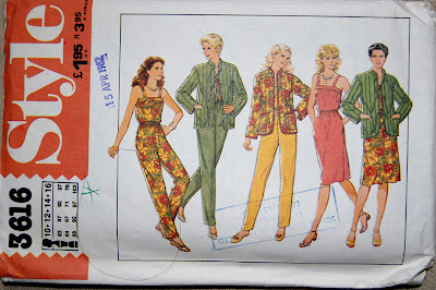
One of the patterns is a 1982 set including a really simple skirt, summery blouse, trousers and quilted jacket.


I love how wearing the matching top and trousers makes it look like a playsuit or the top and skirt makes it look like a dress.  So versatile!

This pattern is multi-sized for 10, 12, 14 and 16 (the size 10 is bust 83cm, waist 64cm, hip 88cm, the size 16 is bust 97cm, waist 76cm, hip 102cm)


I actually got another pattern at this closing down sale that is almost identical, so I obviously don't need them both.

The second pattern was actually tucked into another pattern envelope (I had lots of weird things like that at this sale - it was quite exciting going through all the envelopes!).


There isn't a date on this one, but it looks quite late 70s in style to me.  You might have noticed that the writing on the envelope isn't English ... This pattern is actually German (from Frankfurt to be prescise!), but I don't think that would be a problem for an experienced stitcher.


The language isn't what put me off, though ...  However much I like this style of dress, that kind of waistline just doesn't suit me, which is a shame because it's a really cute pattern!

If you'd like either (or both!) of these patterns, just leave a comment on this post saying which you'd like before 11pm (UK time) on Friday 1st July and I'll draw a name at random for each pattern.  Of course, I understand the Neue Mode pattern in particular is a bit specialist, so if no one's interested, I'll take them to a charity shop, so don't worry, someone will pick these up!

If you do enter, good luck!

Thursday, 23 June 2011

Fabrics for Aprons

If you've come over here from Jane of All Trades, you might remember me mentioning something about a petal apron giveaway.  Well here's something to whet your apetite while I'm working on them:


And if you didn't see it on Jane of All Trades, here's what these fabrics will be made up into:


I'll be making a few full aprons and a few half aprons, so the lucky winners will have a choice.  The making is taking a little longer than I'd planned as I've made some changes to the pattern, so I hope this will keep you satisfied in the meantime  ;)

Getting Organised for Stitching

A while back I read a guest post by Casey of Elegant Musings over at Tilly and the Buttons about Planning Your Sewing.  Now I'm a bit of a sucker for organising (I used to do it for a job), so how I went for so long without bringing that love of organising to my sewing, I have no idea, but somehow it happened!

I love Casey's ideas for planning your makes ahead of time, prioritising them and ensuring they work together (so necessarily for a cohesive wardrobe, which I utterly don't have!).  And, don't tell anyone, but I'm the kind of sad person who quite likes spreadsheets.  The shame!

A couple of months ago I actually went through my stash and measured every piece of fabric and wrote it down, so seeing Casey's post inspired me to get my sewing-geek on and take it that one step further (a step too far, perhaps?!):


Yep, that would be a spreadsheet showing all my fabric.  Colour-coded and sorted by yardage.  I told you it was a step too far!


There are headings for:
  • a description
  • the composition - I try to note this when I first buy it as sometimes I forget.
  • size of piece - from a scrap to metres and metres!
  • the project concept or pattern I have planned for it (if any!) - I might have a vague concept that I want to make a wiggle dress and, if I'm really lucky, I might even have a pattern picked out!
  • further info - for instance, one of the fabrics shrinks loads when pressed - eek! - so I'll be sure to pre-wash that!
  • colour type - this is just one word for the dominant colour for very geeky reasons ... It means I can sort the spreadsheet/database by colour, so I can see what fabrics I have that go together or fit a particular colour scheme.  Yeah, you can mock me now if you'd like.  *Hangs head in geeky shame.*
  • colour description - a more detailed description of the exact shade of colour and the colours and patterns going on.
  • plain colour?  This is to flag up those plain fabrics - this has shown me I have far too many prints and patterns!  I must get some flat colours.

But let me defend myself!

You see, what I've done is make a spreadsheet like Casey's for projects with separate workbooks for fabric and patterns to help me marry up patterns with fabrics I already have.  The fabrics are colour-coded by yardage (blue for 2.1. to 3m, for example) and then the patterns have the same colour-coding:


Seeee?  So if there's a pattern I'm eyeing up and it's coded blue it requires between 2 and 3 metres, I know to look at blue-coded fabrics to find something with enough yardage to work with it.


I think there is probably an easier way of recording all these patterns - I had to do an entry for each view because of the different yardage requirements - but this seems to work.  The headings for patterns are:
  • Description & View - a brief description of the pattern and this particular view.  I haven't put pictures in the spreadsheet, so this is to remind myself of which pattern I'm talking about.
  • Item - what kind of item it is.  Again, this is a bit of organisational geekery so I can group all my dresses or skirt suits together.
  • Manufacturer - self-explanatory.
  • Number & View - ditto that!
  • Vintage?  Whether or not it's vintage or a repro pattern or simply a modern one.  I'm not sure why I put this in, really, just out of interest, I suppose!  Plus it probably helps me to remember which pattern I'm talking about.
  • Size and Recommended fabrics - self-explanatory.
  • Fabric 115cm, Fabric 150cm - the metre-age required for each of these fabric widths.  This is what I've sorted the spreadsheet by.
  • Notions - notions, interfacing, lining, interlining, etc.
  • Requires re-sizing?  Notes on fitting.
  • Fabric assigned (if any) - self-explanatory.
  • Love rating (out of 5) - simply how much I bloody love the pattern, with 5 being adoration at first sight.  The spreadsheet is sorted by this as a secondary sorting category.
So, while that's all rather boring, it's proving all rather useful, too. I'm already thinking about what I can do with that 2m of taffeta that's been hanging around for ages with me wondering what to make from it ... hmmm ... decisions, decisions!

What about you, are you organised in your sewing?  If so, how do you do that?

Monday, 20 June 2011

Sewing with Singer, 1954 - Part 1

I have something rather lovely to share with you today:


Please excuse the dust!


This is a copy of The Singer Sewing Book by Mary Brooks Picken (MBP) from 1954, which was given to me by a very kind friend who found it on one of her second-hand shop excursions and thought I would like it.  Like it?  I love it!  It appeals to the bibliophile in me, as well as the stitcher and the vintage-lover.  It has old book smell, pretty pictures and interesting techniques.  What's not to love?


And it’s all written in that quaint 50s style – I absolutely adore the dedication at the beginning:
This book is dedicated to women and girls -- and especially to teachers of sewing everywhere -- who enjoy the feel of fabric, the beauty of textures, the precision of stitches, the smoothness of seams, and who delight always in appropriate fabrics carefully cut and made up for a happy purpose.
So it doesn't exactly appeal to the feminist in me, but it gives a really fascinating window into that time and there is something sweet about the style of writing: appropriate fabrics carefully cut and made up for a happy purpose.  Isn't that what we all aim for when sewing?

Even better, this book is actually quite useful.  I use it as an additional reference as sometimes explanations in other books don’t make sense to me or they miss out a topic completely.  It's also handy when using vintage patterns - sometimes they use old-fashioned terms that I don't understand, and this helps me to work out what on earth they're on about!

I'm planning to share parts of this delightful book with you over the coming weeks (or months, even!), but today I want to show you one of my favourite sections: Colour and Clothes.

Dotted throughout the book there are colour pages with all sorts of delights and horrors and this page caught my eye right away.


It tells us that

A chief delight in making one's own clothes is being able to find a delectable colour or print -- and irresistible one -- and using it to make a "dream dress" so becoming that every wearing brings genuine happiness.
I'm not so sure about the "genuine happiness", but wearing a becoming dress in a delectable fabric certainly does put a spring in my step and a smile on my face.

As you might have guessed by now, this section of the book discusses what colours do and don't suit different complexions.  It gives some "basic rules" to help us choose colours that will be becoming and instructs us to consider the following:
  1. Is the colour suitable for your individual characteristics?  Your natural skin tone?  Your eyes?  Your hair colour?  Your figure proportions?  Your personality?  Your age?  Position in business, community, society?
  2. Is it suitable for your purposes?  The occasions for which you will wear it?  The season?  Your mode of transportation?  The type of community in which you live?
  3. Is it practical?
There are some obvious points there, unsurprising things to consider - skin tone, eyes, hair, etc.  There are also some that seem rather strange to me, like considering whether something suits your position in the community or society.  That's just not something that would cross my mind, but then there was a much greater sense of community then and, dare I say, stricter rules within society about what was and was not appropriate for this person or that. 

I do like that they suggest considering your personality as well as the visual elements of you.  There are clothes, colours and prints that, while lovely and becoming, just do not make me comfortable.  I sometimes find myself saying "it's nice, but it's just not me" and I think that's that element of personality coming in.  No matter how great a colour works with your skin tone and hair colour, if it doesn't suit your personality and make that glow, it just won't suit you.  That's how I feel, anyway, and I think that's what MBP means by considering whether or not something matches your personality.

And as for those visual elements of you, MBP suggests

holding up colour samples against your face to be sure that skin and eyes and hair come alive in connexion with the colour.
I did chuckle when I read the tip to hold up colours at home without make-up as "then when the right make-up is used, you can be even prettier in your carefully chosen colour."

Now, then, those colours - here are the colour fans she suggests for the various "types" as she calls them (though I suspect the colours have changed over time):

Light and True Blonde Types
Blondes have hair ranging from almost white or "ash" to golden blonde.  Their eyes may be light blue or clear blue, grey, green, hazel, or brown.  Complexion varies from very fair to peach or golden tones.  Colours for these types should be clear and fresh looking.  When natural colouring is delicate, never overpower it with too vivid a colour.  Pastels are usually more flattering.

Medium Blondes or Hazel Types
Medium blondes range between blonde and brown including those with an auburn tinge, eyes are usually light blue, blue-grey, hazel or brown; complexion fair or medium.  Notice that the colours selected are less vivid than for true blondes.  This is because very bright colours detract from the more neutral colour of the hair, eyes, and skin commonly found with these types.

Grey-Haired Types
Grey -haired types may have skin and eye colouring of any of the other groups and may vary their choce of colours accordingly.  The selection should be suited to the age, surroundings, and activities of the individual.  Sometimes when the natural pigmentation leaves the skin and hair, the skin takes on a clear cameo quality.  Soft and subtle colours and white bring out this clear beauty very effectively.
 
Red or Auburn Types
Redheads range fom light golden red to dark auburn, with blue, grey, hazel, or dark brown eyes.  Their skin tones may be similar to those of any of the other groups from blonde to brunette.  If you are blessed with such distinctive colouring,make the most of it.  Never tone it down.  The reds, the pinks, teh deep purples are not for you but there is a wide range of attractive browns, greens, and blues.

Medium Brunette Types
Medium brunettes are those with chestnut or medium to dark brown hair, and blue, grey, grey-green, hazel, brown or black eyes.  Complexion may vary from fair to near ollive.  People in this group often make the mistake of wearing dull, indeterminate colours when a positive shade would be much more becoming.  The colours shown here can all be used to advantage by this group.

Dark Brunette Types
This group includes those with dark brown or black hair, eyes of blue, grey, grey-green, hazel, brown, or black, and skin ranging from very fair to olive.  Those who had black hair before it turned to grey will also find good colours in this range if their natural colouring is well defined.  Even primary colours may be very effective.  Sallow skin brunettes should avoid yellowish greens or orange.


But if there's a colour you love that doesn't suit you, don't worry, all is not lost!  MBP suggests that you can still use it as an accent or for accessories, especially if not worn next to the face.  Phew!

As for flattering the figure, she suggests black, dark colours or greyish colours for making your seem smaller or slimmer than brighter tones.  I'm not sure if I agree with her rule to remember, though: "When in doubt about colour, always choose black".  Black can be hugely unflattering to some people and I think softer colours like dark blues (such as navy), greys or browns can be a much better choice if black overpowers you.  More importantly - black can be just plain dull and some people fall into the trap of only ever wearing black.  Colour is fun and fab!  But that's my take, and I am a bit of a magpie for bright colours!

One piece of advice MBP gives that I really have to agree with and should probably learn from is to
Remember always the value in the wardrobe of good basic dresses in dark colour that can be made to suit occasions by the use of the right accessories and to give colour pleasure through subtle accent.
The downside of my colour-attraction is that I have plenty of clothes in bright colours and prints, but very little in solid or more neutral hues.  I should really sort that out!

My new sewing resolution: to make at least one plain skirt and at least one plain dress by the end of the year!

Anyway, that's it with the nuggets of wisdom from MBP on colour, but if you're loving this book, let me know and I'll be back with my girl Mary BP and more 50s sewing fun!

Friday, 17 June 2011

Welcome!

Hello there and welcome to my new blog!  This is the new home of all my stitchery projects, while my old blog, Jane of All Trades, will remain home to my writing on books and, er, writing.

I have lots planned for this place, including: an apron giveaway; straightforward calculations for half circle skirts; sewing with vintage patterns; a vintage pattern giveaway; 50s sewing with Singer; learning to knit; drafting a men's waistcoat from scratch; some words on 18th century fashion; playsuit love; experiments with piping; WIPs and probably some UFOs, too!

So, I hope you'll enjoy reading my scribbles and joining in with comments while I settle in to this new home.  I'm looking forward to it.